“Lighting up the sky while painting with acrylics can be accomplished with ease,” she said. Until I learned to add acrylic glazing liquid, I would never have thought it so easy.
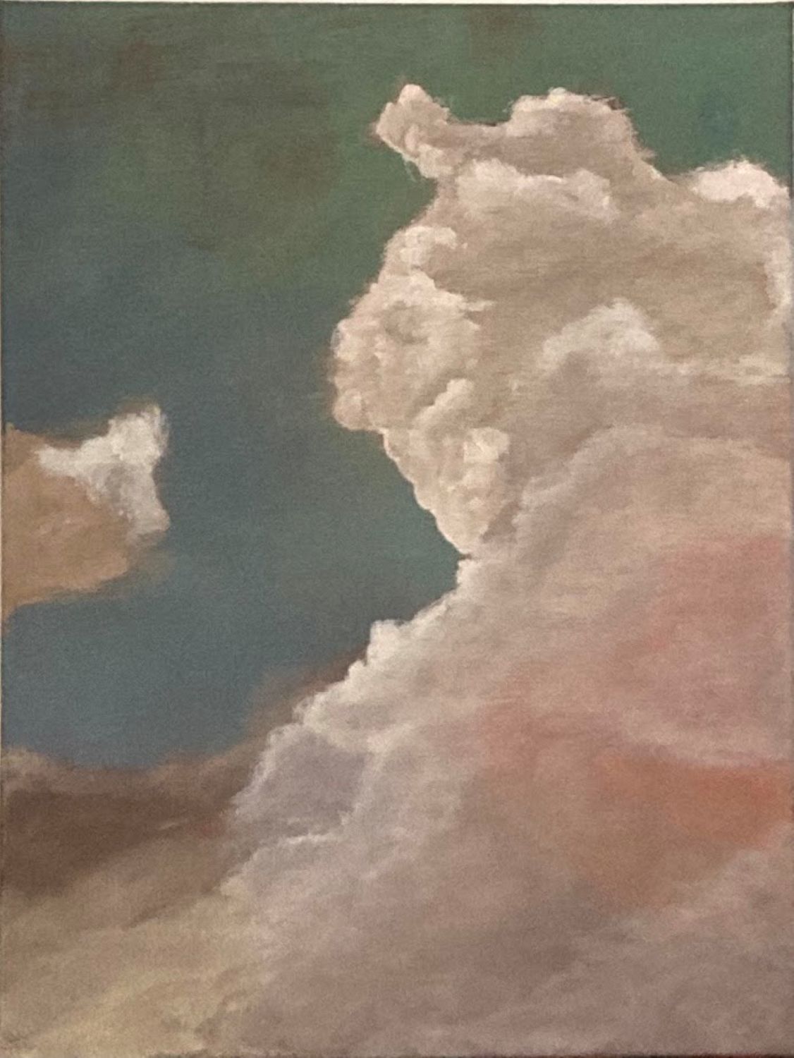
Clouds can be tricky because in the sky they are forever changing shape, form, color, and detail. In this lesson, we gathered firsthand experience with using the underpainting to our advantage for letting the light shine.
The underpainting for this cloud painting began with a very warm red/orange. Then the blue/green to blue sky was painted over the red/orange underpainting leaving one area about middle right to remain red/orange. Along the lower three inches of this work, a dull purple was used over the red/orange. If you examine the greenish-blue sky tones closely, you can still see some of the red/orange tones. And where the red/orange is covered by clouds in white to creme tones, the glazing liquid was added to the paint, creating a translucent effect.
Overall, the sky becomes lit by a morning sunrise, and the warmth of that experience can be felt in this piece. Demonstrating this technique for lighting up the sky during a recent painting session certainly brought a lot of “a-ha” moments from my students.
This class called: LIGHT UP THE SKY is only one in my repertoire of acrylic painting lessons held monthly at the Gilmer Art Center in downtown Ellijay, Georgia. Stop by in person some Friday to see what we are up to. Or visit the Gilmer Arts Website https://gilmerarts.com/art-gallery/#classes to browse all the art classes on the schedule and follow my Facebook page: https://www.facebook.com/ArtwBecca/events.
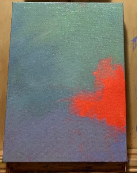
1st Photo: red/orange underpainting and blue/green sky underground with underpainting glimpse.
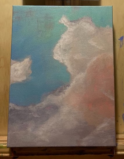
2nd Photo: 2 layers of white clouds painted over the underground using additive: acrylic glazing liquid.
UNDER THE MADNESS / W. Va. Farm Under a Storm Cloud / Acrylics to Wrapped Canvas / 11 x 14 x 2 / $192
Creating balance in a painting is an exercise I practice each time I paint a landscape. The light that appears in the sky along the edge of the dark angry clouds is reflected on the white farmhouse and on the tips of the grass growing in the field in front. The layers of charcoal gray in gradient were the trickiest parts of the sky, but I’m finally pleased with this result.
The focal point is never in the center; as I try to follow the thirds’ theory for a focal point. I prefer to exclusively place detail in the focal point areas, everything else gets only a suggestion of detail. The addition of light along the edge of the dark clouds falls somewhere in between the details of the buildings and the lack of details in the foliage along the horizon flanking either side of the house.
The madness of the storm cloud brings moodiness to the scene. The rosey haze along the horizon line is repeated in the sky and the foreground, although it’s not obvious. The color palette for this composition was inspired by a painting with similar subject matter under blue skies. (See the last image for the color inspiration.)
TWICE AS NICE / W. Va. Farm in Autumn Under Blue Skies / Acrylics to Wrapped Canvas / 11 x 14 x 2 / $192
See something you wish to purchase or have printed into a greeting card? Send an email request to the artist here: beccasgreencraftstudio@gmail.com
LESSON 3: Use your Imagination to simplify the scene. I like to squint at the scene and decide what is most important to the scene. Asking a few questions like: What do I see first? Where do my eyes go next? Is it fluid movement or jerky? What would make it more transitional and fluid? The answers help you to edit out the elements which block the emotion you desire. Keep in mind that a vibrant color palette will bring excitement, while a more muted color palette will calm things down. A highly contrasted value study will help you decide whether you have achieved your goal–providing an emotional reaction.
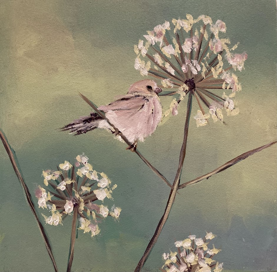
The inspiration image (Image 1) below shows a tiny sparrow in the same color palette as the field of lingering Queen Anne’s Lace flowers. The stems are dominant in the foreground where the sparrow is perched. The darkest feathers match the stem coloring. And the sky in the background is filled with muted shadows.
Caption: Image 2: Painting: Lady Sparrow by R. Shuler, Acrylics to Wood Panel 8x8x2, $96.
Notice how the painting (Image 2) has those same aspects but in less detail. Rather than paint every single flower head and stalk, the artist painted only one plant. It was the most important one because of the bird perched there. Do you see how the entire mood shifts when a new color scheme is used in the sky shadows? The artist added the blush of pink from the sky to enhance the beauty of the tiny sparrow. This piece is named: Lady Sparrow—playing off the name of the flowers in the field: Queen Anne’s Lace. What do you think about this simplifying technique? Will you attempt it in your next work?
Becca invites you to stay tuned for more insights! Lesson 4: The Magic of Color placement and Value explores the importance of color and value placement. It questions whether one should create a color palette chart in advance or skip this step and jump in headfirst. If you scroll to the end of this blog post, you will find Lesson 1 for The Illusion of Detailsin Practice art lessons by R. Shuler / aka: Becca the artist behind the Green Craft Studio. Peer at her Facebook page when you find the link at the end of Lesson 1 and sign up for her ongoing acrylic art lessons held two Fridays per month in Ellijay, Georgia via the Gilmer Arts Center.
LESSON 2:Creating the Illusion of detailis challenging and takes practice. Practicing the illusion of detail rather than painting all the details allows one to create intriguing artwork. Adding too many details can make a scene visually busy. If we “quiet the noise” and edit the scene into the most basic elements, we can create the illusion of detail. Simply stated: We get more done with less; we simplify the process just as Impressionists do. So much information can be conveyed with one single stroke of the brush if it’s done well. It’s a fun way to paint, but it’s not easy. Copying the subject is easy. Simplifying the subject and painting with fewer strokes is more difficult.
This painting process is beautifully illustrated when comparing an inspiration photograph to the work in progress. Can you see where the artist simplified the scene? The overall scene is represented; however, the details are more imagined than real. If you are one who is attempting to loosen up your paintings–adding fewer details–this technique is one you should practice. Some questions to consider: How do you decide what to remove and what to keep? Which elements require you to keep the details? More on this in future lessons.
Simple artistic impression of real scene in the mountains of a flower field with an old barbwire fence.
What do you think it takes to master this process? Lesson 3 will help you relax as you learn how to use your imagination and let it do all the work for you. Stay tuned for more next week.
LESSON 1: Getting Caught Up in the details is a common problem for aspiring artists. Trying to paint every leaf, branch, blade of grass, highlight, shadow, line, or shape can be overwhelming not only for the artist but also for the viewers of the cluttered painting. Determine why you are painting the scene? What is it that drew you in? What do you feel as you work on it? Provide that emotional connection to those who admire your work, and you’ll find followers. For instance: Do we feel the emotion of the storm in those dark clouds in a moody sky or are we too focused on the details of the raindrops?
This red barn painting is a perfect example of creating the illusion of detail without adding every little board and nail. Notice how the illusion of texture is added with only a few strokes of the brush. In the pine trees, not every pine needle is added, nor is every bump in the bark. Overall, the painting is aesthetically pleasing, well-balanced in color value and composition. What else do you enjoy about it? What would you change? What style did the artist use: realism, impressionism, abstract?
First, what exactly is the illusion of detail and why is it important to an artist? This is Lesson 1. There are five more lessons to come. See the list below and stay tuned. If you wish to enroll in an acrylic paintings session, reach out by way of email to learn more about art lessons with Becca: beccasgreencraftstudio@gmail.com
The Illusion is Challenging
Using Your Imagination is Relaxing
Colors & Value placement can be Magic
What are Feature Details?
Become a Master of Illusion with this TIP
Becca adds Acrylics 101 Sessions for students from beginners to advanced. She paints with you during class and each session helps you to build skills necessary to paint beautiful gallery worthy pieces of artwork. She posts her session schedule by adding weekly events to Facebook–her acrylic sessions are usually on Fridays between 1-4pm and held at the local Art Center where she lives in Ellijay, Georgia. Follow her Facebook page to keep up or join a session: https://www.facebook.com/ArtwBecca/events
My studio has changed its focus lately, or at least a corner of the studio that is. I have been wanting to paint sunflowers for a while now and went to work on this apron prototype last week. The results are fabulous! I hope to answer as many of your questions as I can in this week’s craft blog. However, do not hesitate to comment with a question at the bottom if I happen to leave your’s out. 🙂
Sunflowers are popping up all over the landscape here in North Georgia this month. Seeing them in all their glory moved me create my own canvas (apron fabrics) covered in sunny flowers. My artist friend, Sue King, does this all the time. She paints pillows and aprons using items from nature like leaves for stamping on neutral cloth. She heat sets the paint after it dries. I hesitated to do this technique in the past because i didn’t think it would be very durable. Turns out it is very durable. Sue showed me how durable it is when I realized how often she uses and then washes her painted tablecloth–its white cotton with leaf stamping in burgundy, browns, rusts, & greens.
I searched magazines and books and images on the web for ideas for sunflower designs and color. I had some green burlap to use for a ruffle trim on the apron and used that color green in the center of my design. I also painted the ‘seeds’ so that the fibonacci pattern was evident.
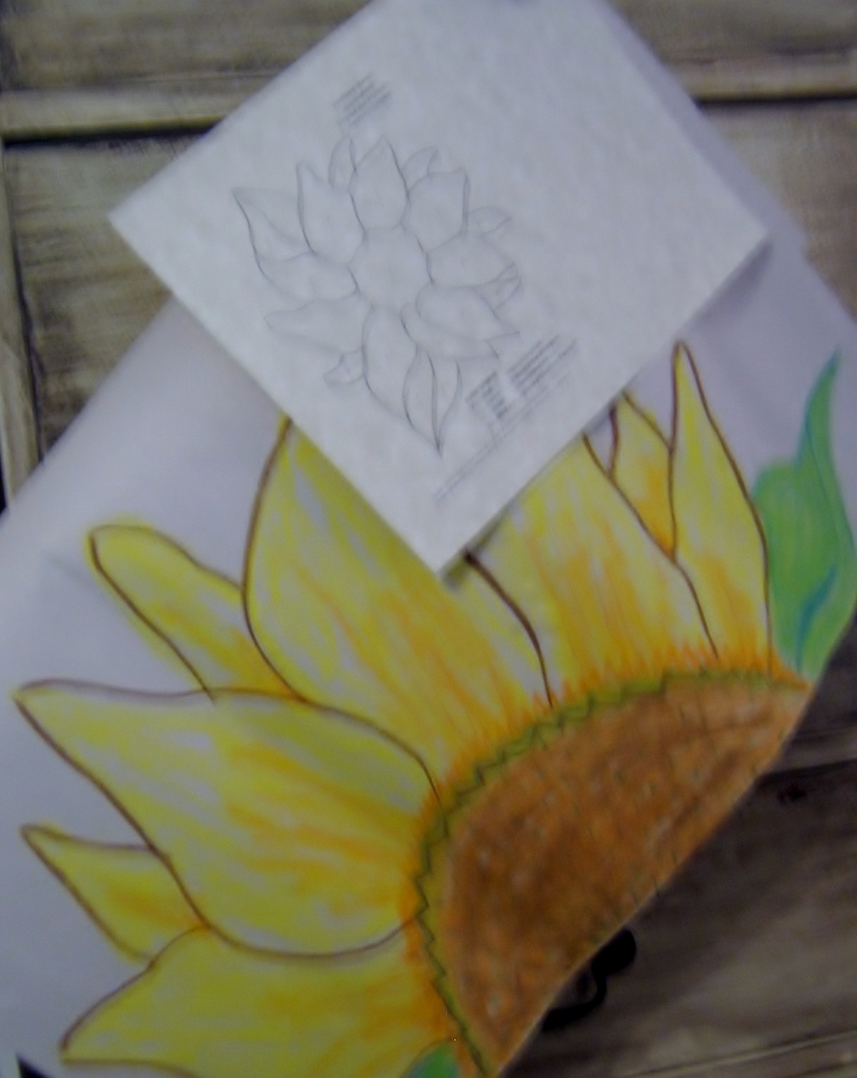
I wanted it to be somewhat realistic, but not perfect. I found a simple outline drawing in a color book to be the most useful when I began the process on the fabric. I sketched the design onto craft drawing paper to use as a visual aid as I worked on the fabric with the paints. I colored it with oil pastels. It seemed so easy to do, I was ready to begin on the fabric.
Sketch the design and color it.
I cut out several aprons from a lightweight ivory fabric in the studio stash pile. I taped it to a board to keep it smooth as I worked with it. That tip came from watching Sue in her studio. I sketched the design to the cloth, enlarging it from my drawing. And then I gathered the tools for the painting process and mixed my color palette. Before long I was fully absorbed in the process of creating my first sunflower apron. After I finished the first, I couldn’t stop. I was having too much fun to call this work! Which is why I love working in my Green Craft Studio. I get to make things that I love for others to appreciate and then love.
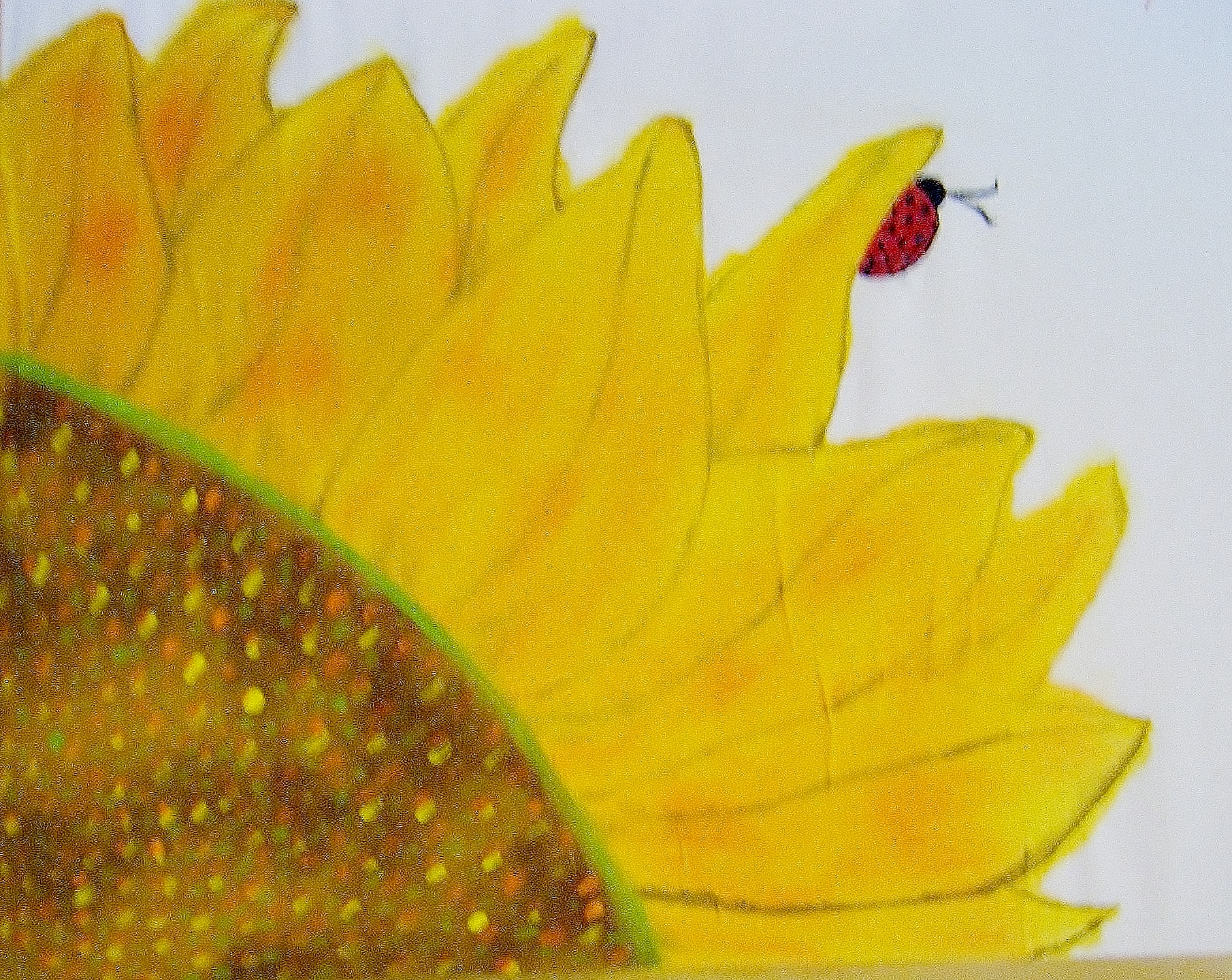
As I work on my second sunflower apron, a memory floods my mind and won’t let go. Its a memory of a photograph of my first home grown sunflower plant. (Here I am at the end of Summer 2014, creating a sunflower on fabric, and this memory pops up like the sunflowers I see in my current landscape.) The memory is vivid, and it moves me to add another dimension to this apron. A dimension that was not in my design drawing. It’s a ladybug! I didn’t see the ladybug until after we got the film developed.
It’s a LADY BUG!
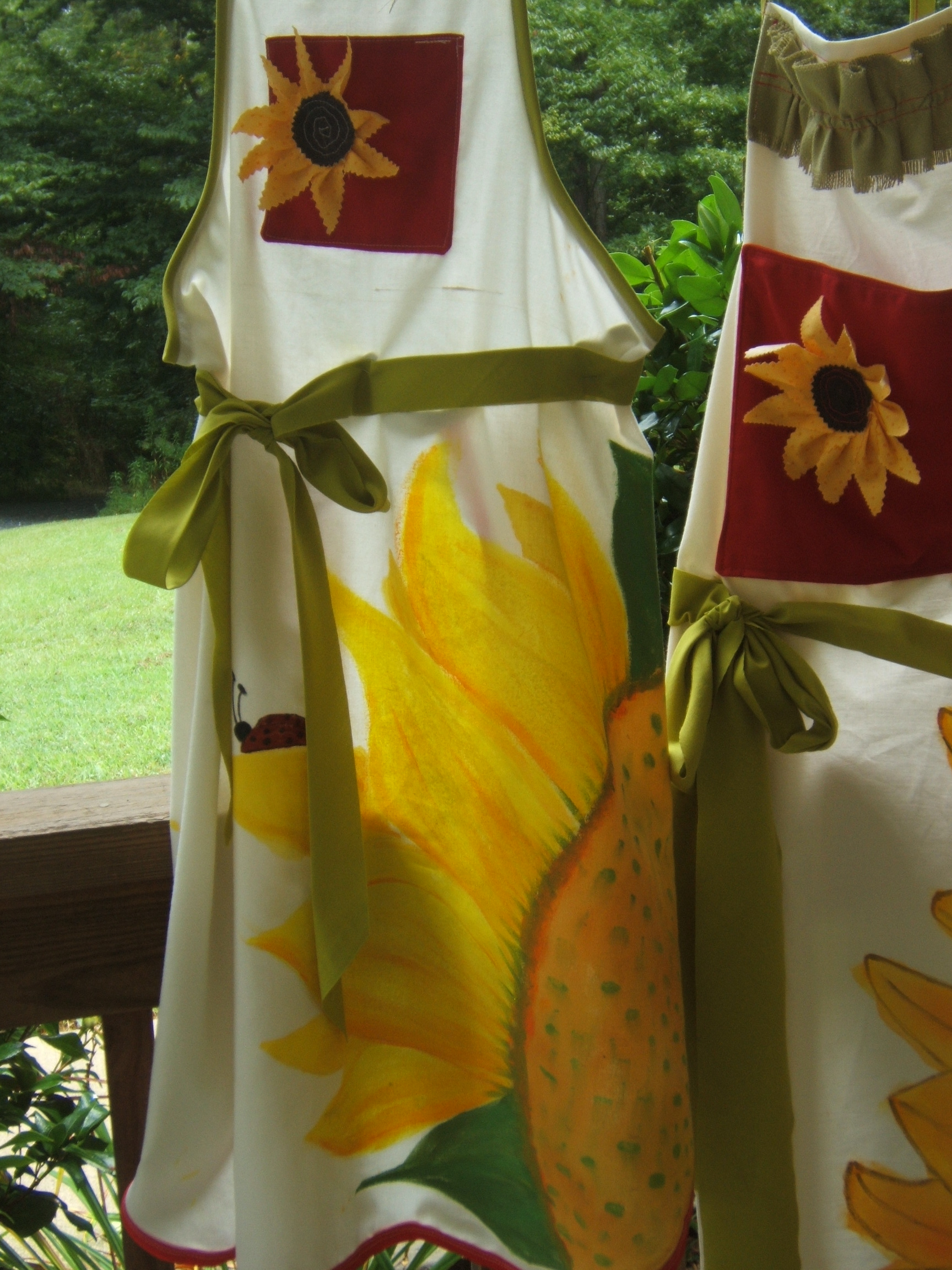
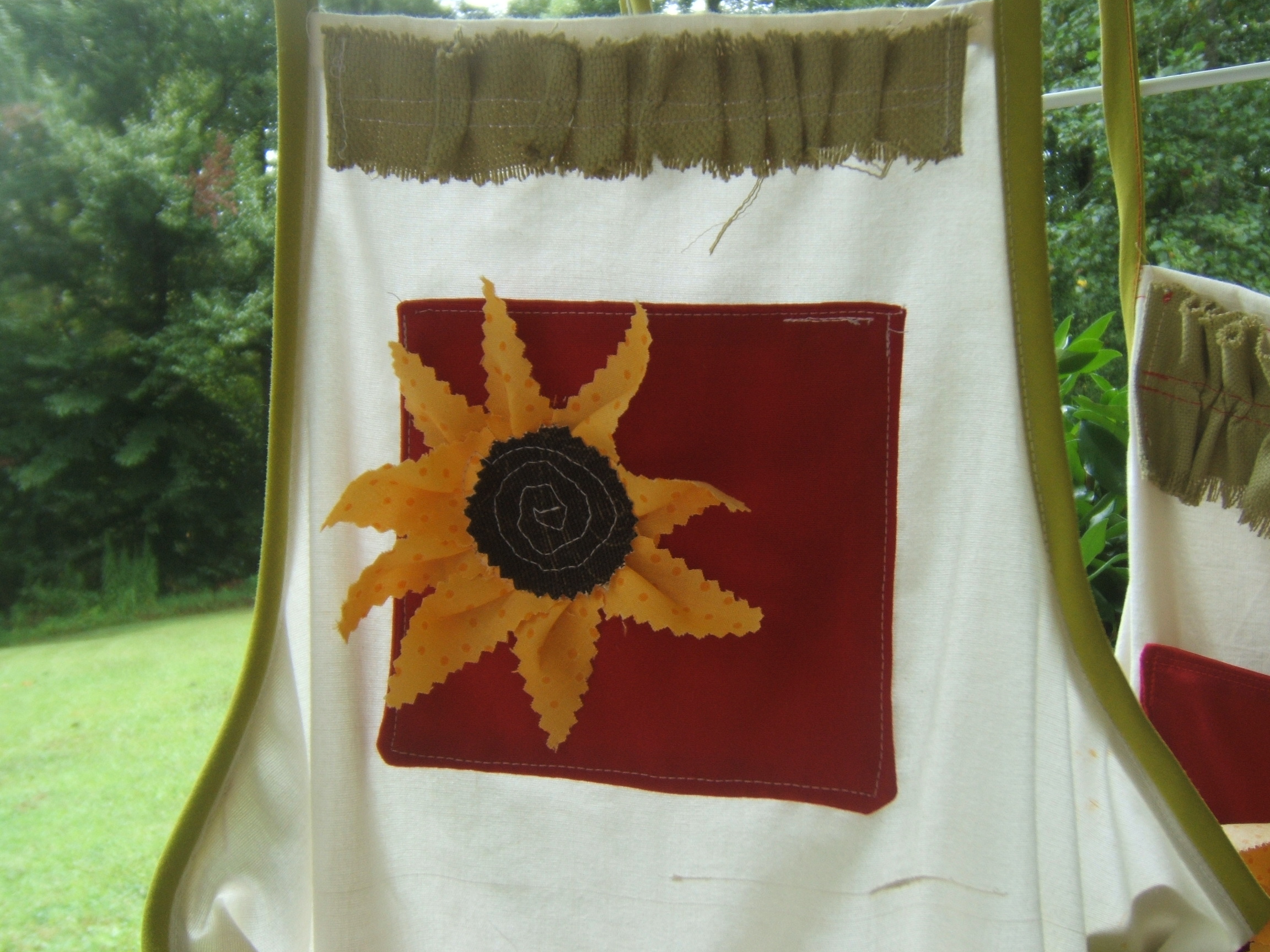
The added apron detail of the ladybug called for a red pocket accent to which I added a fabric flower applique to set the whole apron off. The green burlap ruffle trim finishes it perfectly.
As far as the painting process goes, I started off using tiny brushes and then moved on to a tiny sponge roller for the big sections and the background coloring. The tiny flat sponge applicators worked well for the wide outline around the seed center. Paper plates and plastic spoons worked great for mixing the palette. I used acrylic craft paints in a matte finish. After the painted fabrics dried I heat set each painting from the back of the fabric using a low heat iron. I then washed them in cold water in the washing machine to test the paints. Durable! I dried them in the dryer and pressed them out before finishing the details of the pocket, trims and ties. One of these is going in my Etsy shop and another is going off to be reviewed for a blog feature in November. Elizabeth of Building Bridges Marketing was nice enough to reach out and I am excited to see what she says about my prototype painted aprons. November 16 is my feature date for her blog, so look for my Etsy shop feature article and read the review. It’ll be my first professional review and, quite frankly, I am on pins and needles!


 Becca invites you to stay tuned for more insights! Lesson 4: The Magic of Color placement and Value explores the importance of color and value placement. It questions whether one should create a color palette chart in advance or skip this step and jump in headfirst. If you scroll to the end of this blog post, you will find Lesson 1 for The Illusion of Details in Practice art lessons by R. Shuler / aka: Becca the artist behind the Green Craft Studio. Peer at her Facebook page when you find the link at the end of Lesson 1 and sign up for her ongoing acrylic art lessons held two Fridays per month in Ellijay, Georgia via the Gilmer Arts Center.